The Heart of the Home
It was the windows. And the light. So. Much. Light. When I first stepped inside 11 Colonial Street, it was the three arched windows in the kitchen that took my breath away. When we bought the historic home in 2017, its white on white kitchen didn’t bother me. I liked the brass hardware, and those swoon worthy windows above the sink belied the dated design. Plus, our budget was devoured by a new roof, re-plumbing, and gutting a functionally obsolete master bath. But once the must-do list was done, the kitchen started to annoy me. There was plenty of storage but it was in hulking, upper corner cabinets. Worst of all was the tiny eat-in area. The cramped dining space meant we couldn’t entertain more than 4, and the proximity to the powder room entrance meant zero privacy for guests.
So I began sketching and browsing Pinterest for design ideas. I don’t know where most people start, but for me it was the faucet. I know that sounds weird, but I fell in total love with this golden goose neck beauty from California Faucets, and it inspired the rest of the kitchen design – including the backsplash tile. White subway tile seemed too simple, but I didn’t want anything too ornate or trendy. I kept dreaming about pink tile but no one carried it locally. I took to the internet and stumbled upon the Complete Tile Collection based in NY. They had 2 gorgeous pale pinks so I ordered samples and went full crush on the lighter of the two, Pretty Pink. Could I really pull off pink tile? Would my husband allow it? Should I take it all the way up to the ceiling as a friend suggested? I apprehensively followed my instincts, praying it wouldn’t be tacky.
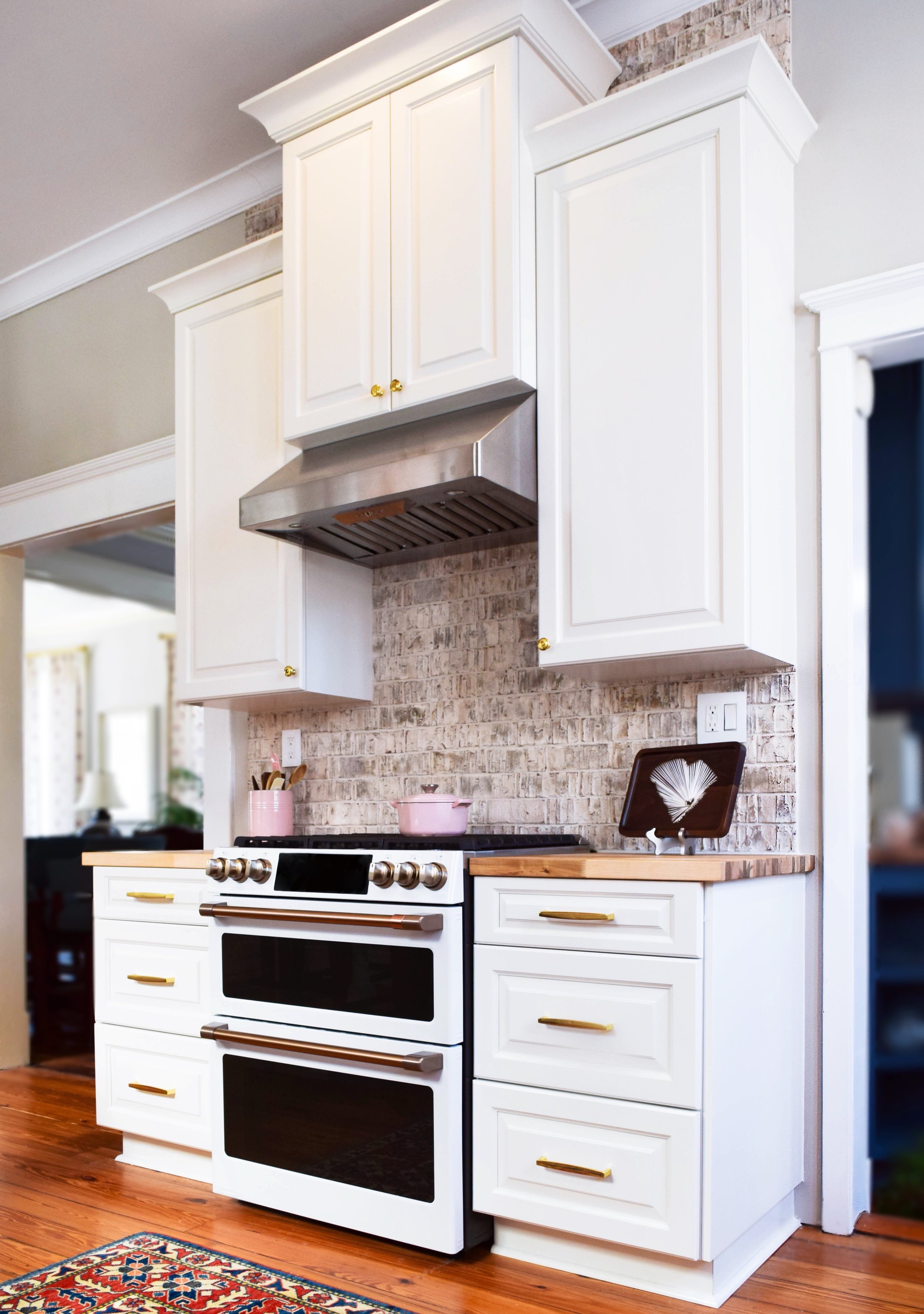
I went with worry-free quartz countertops, but I wanted a place to chop safely directly on the counter, so I opted for butcher block around my stove. The thin brick General Shale Logan Canyon backsplash gives the illusion of exposed brick and compliments the pink tile. I don’t baby this area, I use it… and hard. I’ve already burned it with a hot cast iron lid, stained it with red wine, and turned it green chopping cilantro. But I’m proud of the demarcation, which I say portrays the hard work of a good cook.
Or at least a cook.
The kitchen is too narrow for an island so I needed a peninsula that could seat a crowd.
The base had to be sturdy enough to support the weight of the quartz slab but open so it wouldn’t impede legroom.
I wanted to keep the same monochromatic look of the old kitchen, but I was stumped on appliances. I couldn’t picture stainless steel with the brass hardware, but wouldn’t a white fridge look cheap and dated? I searched and searched and was about to settle when I came across something SO new and exciting: GE Café matte white appliances with brushed copper handles. They are gorgeous and exactly what I wanted!
I did things I would scold clients for: two different backsplashes, two different countertops, anything pink for heavens sake! But kitchen trends come and go quickly. Unless you’re planning to move in the next 5 years, anything you do in your kitchen will be out of date when it’s time to sell. Have some fun like I did.
The kitchen is the heart of your home… so why not make it PINK?
Photo credit: Corbett Tripler


